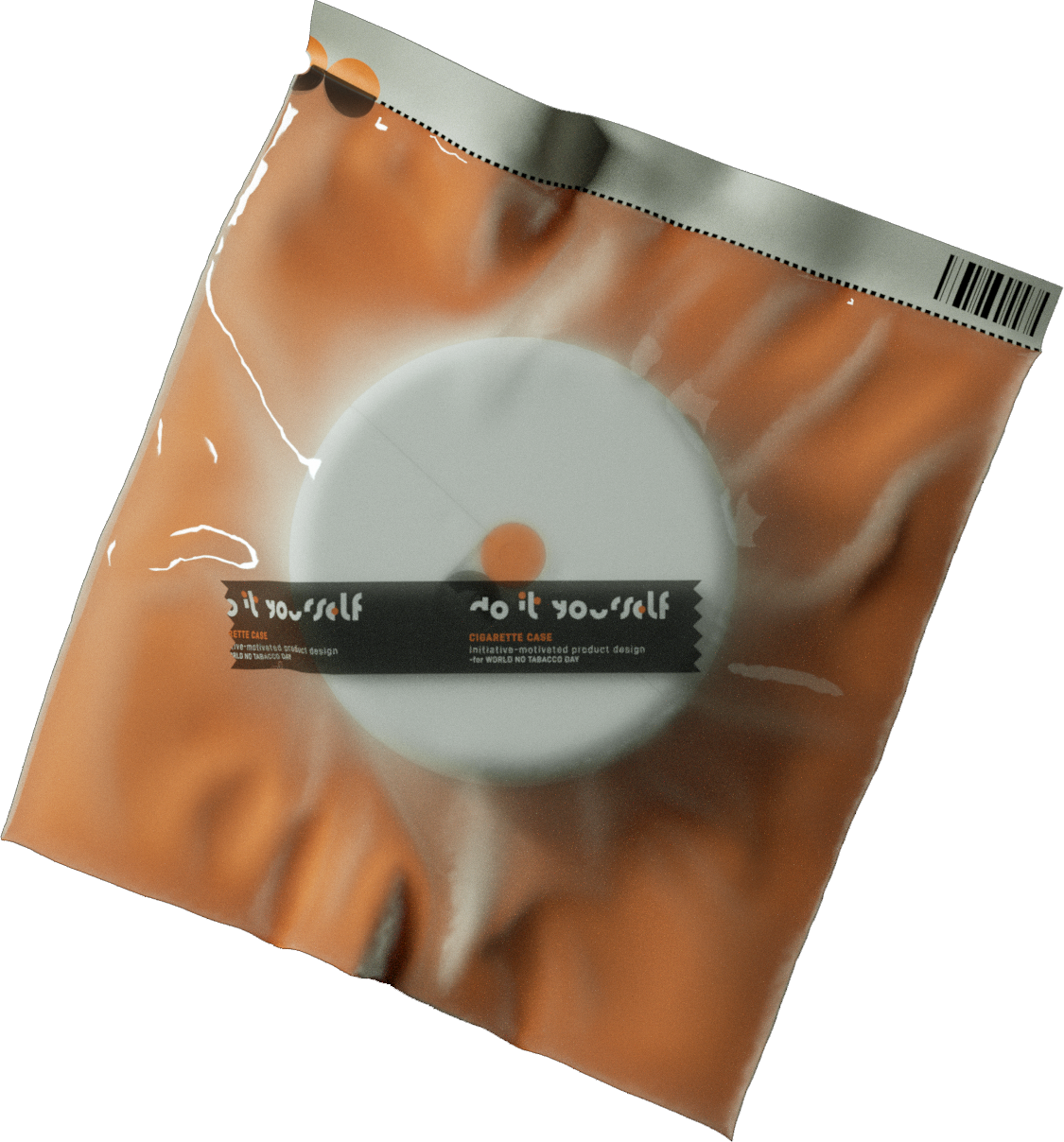
Do it Yourself
CAMPAIGN / Typeface / Product / Packaging
This campaign seeks to rekindle people's intrinsic drive. It advocates for retaining the initiative that defines our humanity. There are always tasks that are uniquely ours to accomplish.
The logo chosen for this campaign is "DO." It symbolizes active engagement, highlighting the inherent agency of human beings. Accompanied by typography featuring simple geometric shapes, the ORANGE DOT functions as a metaphorical switch, igniting inner motivation within the human psyche.
At the heart of the campaign is the design of the product family. These items are designed to inspire users' initiative. While they may not possess the utility of artificial intelligence, they serve as reminders of something far more significant.